
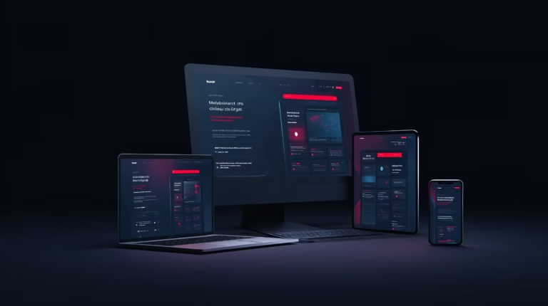
Did you know that more than half of internet traffic today comes from mobile devices? Your potential customers will see your website on their phone first and if it's awkward, slow or "scattered", they're very likely to leave. Mobile-friendly design is not an optional extra, it's a necessity if you want to be visible, credible and effective on the modern web.
Nowadays, a website’s mobile experience directly affects not only its design, but also its SEO, sales and user experience. If everything looks too small, is slow or unclear on a mobile phone, people won’t stick around to figure it out. They’ll simply leave.
Most visitors are mobile
Mobile phones have become the main tool for finding information. In Lithuania, even older users are increasingly browsing on mobile devices.
If your website is not mobile or tablet friendly:
- the text will be difficult to read,
- buttons are too small,
- design distortion.
The result? The visitor quickly leaves and never comes back.
Mobile-friendly design improves Google rankings
From 2021, Google is switching to mobile-first indexing, which means that the mobile version of a website is the primary source for ranking. Even if your website looks great on a computer but doesn’t work properly on a mobile phone, your Google ranking will drop.
Convenience drives conversions
Mobile users browse fast, look for specific information and want clarity. If a website:
- loading is slow,
- has too much text,
- not intuitive,
he'll just press "back".
Mobile-friendly design helps to keep attention, make the offer clear and encourage action, i.e. filling in a contact form or making a purchase.
Mobile usability = accessibility
A mobile-optimised website allows you to be accessible anywhere and at any time: on public transport, in a waiting room or whilst queuing. Not only does this help you reach more people, but it also gives the impression that your business is keeping pace with technology. This is particularly important for businesses that want to be constantly accessible online.
Mobile design is more than just aesthetics
Mobile-friendly design goes beyond the image to include:
- optimised browsing,
- structured content,
- speed,
- and even the location of buttons.
Good mobile design often translates into a better user experience (UX), although the term ‘UX’ itself is not understood by everyone. Therefore, to get to the heart of the matter, a website must be clear, user-friendly and optimised for natural finger navigation.
A poorly adapted website can be costly
Without a mobile-friendly website, you can:
- losing visitors (and potential customers),
- reduce your Google rank,
- damage your image.
Conversely, investing in mobile design pays for itself. Even a simple one-page website can be effective if it loads quickly and is user-friendly on a mobile phone.
If you’re on a tight budget, it’s worth reading this article How much does a website cost?.
Mobile design is the start of your customer journey
A mobile-friendly design is not just an extra feature, but a necessity for digital business. It determines not only how Google sees you, but also whether a visitor will become a customer.
If you want your website to be truly effective, start with mobile usability. Your customer is already browsing on a phone, so it is important that they can find you conveniently.
It’s worth checking the mobile view in real life
A mobile-friendly design is not just about the text fitting on the screen. You need to check whether users can comfortably read, tap, go back and get in touch. The first few screens are particularly important, as users quickly decide on their mobile phones whether to continue.
The practical test is simple. Open the website on your phone and try to find the service, a price breakdown and the next step. If you have to scroll a lot or guess, the mobile experience may still be lacking.
- the buttons must be a convenient size
- The menu must not hide the most important pages
- Texts must be readable without zooming in
- It must be clear from the first screen where the person has ended up
If this topic is relevant, it is worth moving on to Why does every business need a website?. Another practical addition is How can I clarify the goals of my website?.
If your website doesn’t look great on a mobile phone, it’s worth starting with a simple check. Is the text easy to read, are the buttons clear, and can the page be accessed without difficulty? Sometimes these changes alone are enough to increase conversion rates. You can check the scope of work and budget in the website development price list.
If you’d like to assess which direction would be best for your website in your particular situation, please get in touch. We can take a relaxed look at your requirements, the scope of the project and the first practical step.