
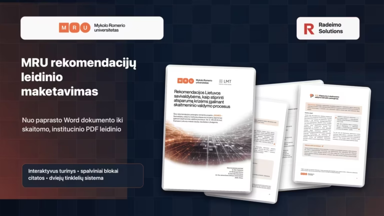
When the document is intended for municipal employees, simply putting the text into a PDF is not enough. Such a publication must be reliable, clear and easy enough to read, so that a person does not open it just to "use the eyes". This is exactly what the MRU project publication layout work was: to turn a simple Word document into a PDF of professional recommendations that would maintain an academic and institutional tone, but not look like a dry bureaucratic file.
The publication was prepared for the Mykolas Romeris University DIGiRES project "Strengthening the resilience of municipal management institutions to crises by enabling digital government processes". The official description of the project can be found here on the MRU website. The final document is intended for Lithuanian municipalities, so it was not a decorative design for the sake of beauty, but a structure, readability and clear presentation of information.
What was the layout?
Layout of the 27-page recommendations publication "Recommendations for Lithuanian municipalities on how to strengthen resilience to crises by enabling digital management processes". The content was serious and dense: research context, methodology, insights, recommendations, quotes, implementation suggestions, project information.
The original document was in Word format. It contained clear content, but visually such a file did not yet function as a publication. The purpose of the layout was to create a reading system: so that a person would understand where a new part begins, what is a recommendation, where an explanation is provided, where a quote, and where a practical action for the municipality.
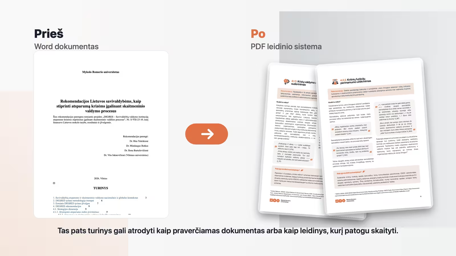
The most important task was to control the information
Such a document can easily become a difficult to read collection of texts. Especially when some pages have more information, others less, and the content must remain consistent from start to finish. Therefore, the layout of the publication here was not only visual work, but also information management.
A two grid system was created. It helped to maintain equal spacing, a clear hierarchy of text and an orderly rhythm of the pages. When more free space appeared on the page, the solution was not to leave a void or artificially stretch the text. Additional information was coordinated with the client to keep the page full but not overloaded.
The general logic of publication layout is described in more detail in the article layout design for business publications. The case of MRU shows well that a professional layout becomes important when the document must not only be transmitted, but also actually read.
Cover: Professional but not bureaucratic
One of the bigger challenges was the cover. The document had to look professional and fit the theme of crisis resilience and digital governance, but at the same time not become boring. Five different cover samples were prepared, from which the client chose the most suitable option.
The chosen cover is based on the mood of the digital network, movement and direction of data. It links the topic of the publication to the technological context, but does not take all the attention away from the title. In an institutional publication, this is very important: the cover should raise the level of the document, not compete with its content.
Layout system: grid, blocks and rhythm
The layout was prepared with the Affinity program. This allowed for precise control of margins, text flows, page pacing and visual blocks. The document uses separate information blocks: recommendations, quotes, explanations and "How to implement in the municipality?" parts.
Each block type had its own visual role. Recommendations are singled out in one direction, quotes in another, parts of practical implementation in yet another. Such a system helps the reader not to read everything at the same pace. He can more quickly understand where the point is, where the context is, and where the specific action is.
The colors were coordinated with the direction of the MRU identity. Orange accents helped maintain a connection with the university's visual language, while neutral backgrounds and light blocks allowed the text to remain readable. Here it was important not to overdo it. Too many colors in such a document would quickly create noise.
Visualizations that help but don't overwhelm
In the publication, visualizations were created based on the presented cartoons and examples. They are adapted to the general color palette, unified and integrated in such a way as to help the reader, but not to overwhelm the text. An illustration in an institutional document should not look like a random picture. It must have a clear function.
Also created a chart based on the timeline example provided. Such elements are important because they turn a long expository text into a more comprehensible structure. When a person reads recommendations, he is not only looking for sentences, but also for landmarks.
Interactive PDF and reading convenience
The content in the final PDF is interactive. The reader can click on the table of contents and immediately go to the required part of the document. It seems like a small thing, but in a longer PDF it changes the user experience. The document becomes not only more beautiful, but also more practical.
Adequate margins, text density and clerical style were also observed. The publication must look neat both on the screen and in print. There's no room for random spacing, uneven headings, or different-looking quotes. Such things may not be noticed individually, but together they create either confidence or a sense of disarray.
Workflow and customer feedback
During the work, there were three rounds of correction. The process went smoothly: first the visual direction was refined, then the specific pages were coordinated, and finally the details were arranged. In such works, the flow itself is very important, as the layout changes along with the content refinements.
"We had a very quick, simple workflow. We tweaked the final layout a few times and there were no problems."
Customer feedback, left in Google reviews
The feedback also emphasized that not only the final work was important, but also the journey to the result itself. This is especially true for this project because the layout of the publication was not a one-time "put into design". It was the overall consolidation of text, structure and visual framework into one clear document.
Why is this layout important?
The guidance document has a real function. It is shared with people who need to quickly understand information, go back to a specific part and use it in practice. If such a document looks like a simple Word export, its value is visually diminished, even if the content itself is strong.
A good publication layout helps the text to be read. It does not decide the content for the author, but helps that content reach the reader. In the case of MRU, this meant combining academic accuracy, subject matter relevant to municipalities, and a clear enough visual rhythm to make the document user-friendly.
If you have a Word document, recommendations, catalog, report or PDF material that needs to look more professional and easier to read, please get in touch. It is possible to evaluate the scope of the content, the visual direction and prepare a layout of the publication that not only looks neat, but also helps the information to work.