
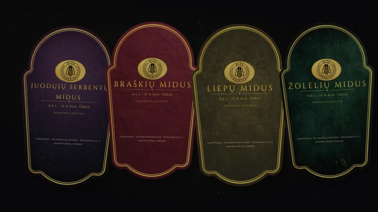
A label on a bottle is not just a pretty picture. It must capture the entire character of the product: its flavour, origin, mood and technical printing requirements. This project involved creating four luxurious label designs for a table drink produced to the client’s specific requirements.
It is important to emphasise that this is not an ad for alcoholic drinks, nor is it intended to encourage consumption. This post outlines the process of design, layout and the creation of print-ready files. A layout created by DI was used for the bottle visualisation to demonstrate more clearly how the label might look within the overall composition.
Task: four flavours, one clear line
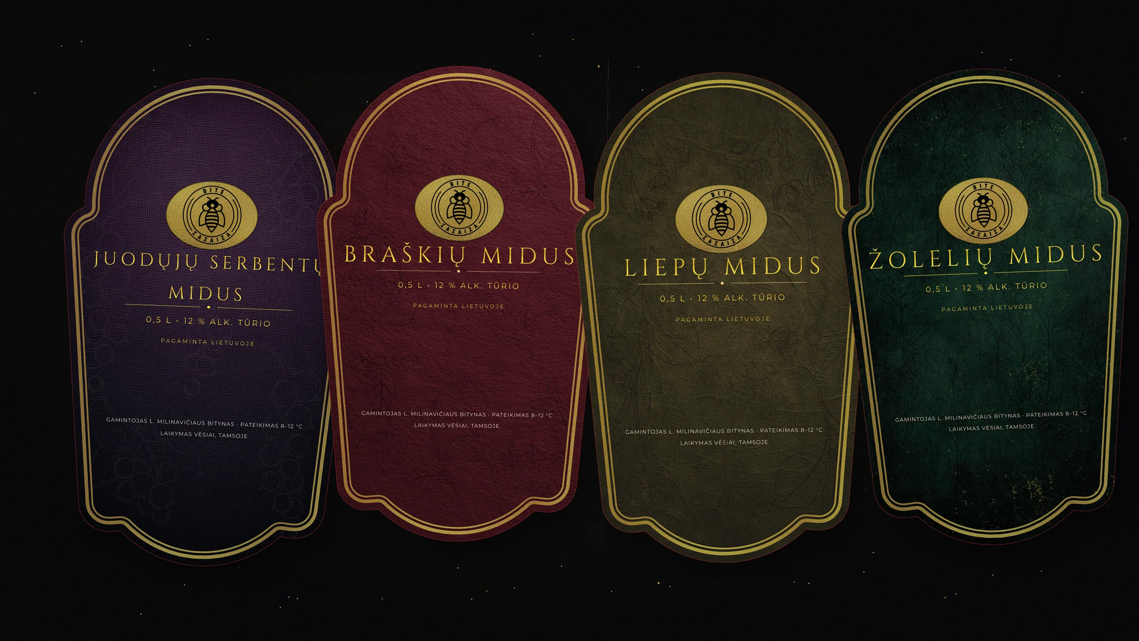
The client brews mead for their own consumption and wanted a personalised, cohesive label design. Four flavours were planned: blackcurrant, strawberry, lime blossom and herbs. Therefore, rather than four random stickers, a cohesive labelling system was required, where each variant has its own character, yet all together they look like one family.
This principle is very important when creating a range of products or personalised items. If each sticker looks completely different, the sense of continuity is lost. If they all look too similar, there is no distinction between the different styles. The aim here was to strike a balance: a luxurious overall theme, the same shape, the same compositional rhythm, but a different mood for each flavour.
The background should speak to one’s taste
Deep, dark and rich background colours have been chosen for the labels. The blackcurrant variety has a dark purple hue, the strawberry mead label is based on a rich red, the lime blossom mead has a calmer greenish-brown tone, whilst the herbal mead transitions into a deeper green colour. All the backgrounds have texture, so the labels do not look flat or cheap.
The delicate botanical motifs in the background are not the main feature. They serve as a subtle hint at the flavour. This helps to maintain a luxurious look, as the label does not rely on flashy illustrations, but allows the colour, texture, logo and border to work together.
Logo customisation and luxurious touches
The client had the Bitė Zazaiza logo, but it needed to be integrated in such a way that it didn’t simply look as though it had been superimposed onto the background. The logo area became the central feature of the label, whilst the gold tone added a sense of value and warmth. The black graphic elements in the logo and the decorative outlines helped to maintain a clear contrast.
Similar work had already been carried out during the development of Bitė Zazaiza’s product sticker design system, but in this case a different approach was needed. Small product stickers and the 120 x 200 mm bottle label are handled differently: here there is more space, more hierarchy and more responsibility for the overall first impression.
Non-standard sticker shape
The clients did not want a simple rectangular label, but rather a non-standard cut-out design. Consequently, a decorative shape was created with a rounded top, curved sides and an extended border at the bottom. This shape immediately makes the label more distinctive, but at the same time makes it more difficult to prepare for printing.
When a sticker has a non-standard cut-out shape, a high-quality PNG or PDF image is not enough. The printer needs a clear vector cut-out line to follow when cutting out the sticker. For this reason, a separate PDF file containing the vector cut-out was prepared alongside the label files.
Files for the printer: more than just a pretty picture
In this project, it was important not only to develop the visual design, but also to prepare the files so that the printers could carry out the work without any uncertainty. We consulted with the printers, checked the format requirements and ensured that the technical files were in line with the production process.
- prepare 4 separate PDF files, one for each version of the label;
- 1 additional PDF file has been prepared containing a vector cut-out outline;
- the labels are intended to be approximately 120 x 200 mm in size;
- an allowance has been added to ensure that an important line along the edge is not cut off when the sticker is cut;
- The layouts are ready for high-resolution printing.
The bleed is one of those details that is often overlooked in the final layout, but is crucial in actual production. If it is missing, even a slight cutting inaccuracy can leave a white edge or cut off the border. In projects of this kind, technique is just as important as aesthetics.
The Affinity programme and a lot of coordination
The labels were created using Affinity, a programme suitable for print-ready layout work. Here, it is important not only to arrange the elements attractively on the screen, but also to control dimensions, resolution, file export, vector elements and print logic.
The project was not the result of a single, quick attempt. We explored the direction, coordinated decisions with the client, refined the sense of luxury, the colours, the integration of the logo, the finishes and the technical preparation. Work like this often only seems simple once you see the final result. There are many small decisions to be made before reaching that final stage.
Why labelling needs to be thought through thoroughly
A good label must work on several levels. It must catch the eye from a distance. When viewed up close, it must be legible. When held in the hand, it must feel high-quality. And for the printer, it must be prepared in such a way that no unnecessary issues arise during production.
The end result of this project was a luxurious, cohesive design that was technically ready for print. Each flavour has its own background, but all four labels clearly belong to the same range. That was precisely the most important thing: not just to create a beautiful label, but to create a system.
If you have an idea for a sticker, packaging or a layout for print, please get in touch. We can discuss not only the visual direction but also the technical files that the printers will need later on.