
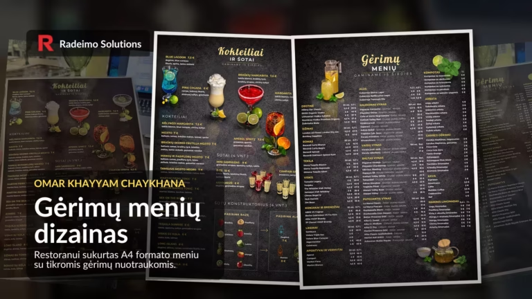
A restaurant menu often looks like a simple list. But in reality, it does much more: it helps guests choose more quickly, showcases the value of the selection and creates a first impression even before they order. If the menu is difficult to read, the customer gets frustrated. If the menu is clear and visually appealing, the decision comes more easily.
This design of a drinks menu was created Omar Khayyam CHAYKHANA for a restaurant in Šiauliai. Their activities can also be found On the Facebook page. This is a Central Asian restaurant, adapted to the Lithuanian market whilst retaining its traditional flavours, drinks and atmosphere. The brief was clear: to create an A4-sized drinks menu that would be informative, user-friendly and visually demonstrate the range of drinks customers can expect.
Real drinks instead of generic illustrations
One of the strongest aspects of this project was the decision to use actual drinks from the restaurant rather than random photos from the internet. The photography was handled by Kostas Rutkauskas / KR Studios. After the photo shoot, the photographs were selected, edited and adapted to suit the layout of the menu.
This approach is vital for a restaurant. The customer sees not an abstract promise of a cocktail, but a tangible image: the glass, the colour, the garnish, the presentation, the atmosphere. The menu begins to function not just as a price list, but also as a visual sales tool. In other words, a simple principle applies here: the customer’s desire to order can be stimulated through visual appeal.
Front page: cocktails, shots and visual treats
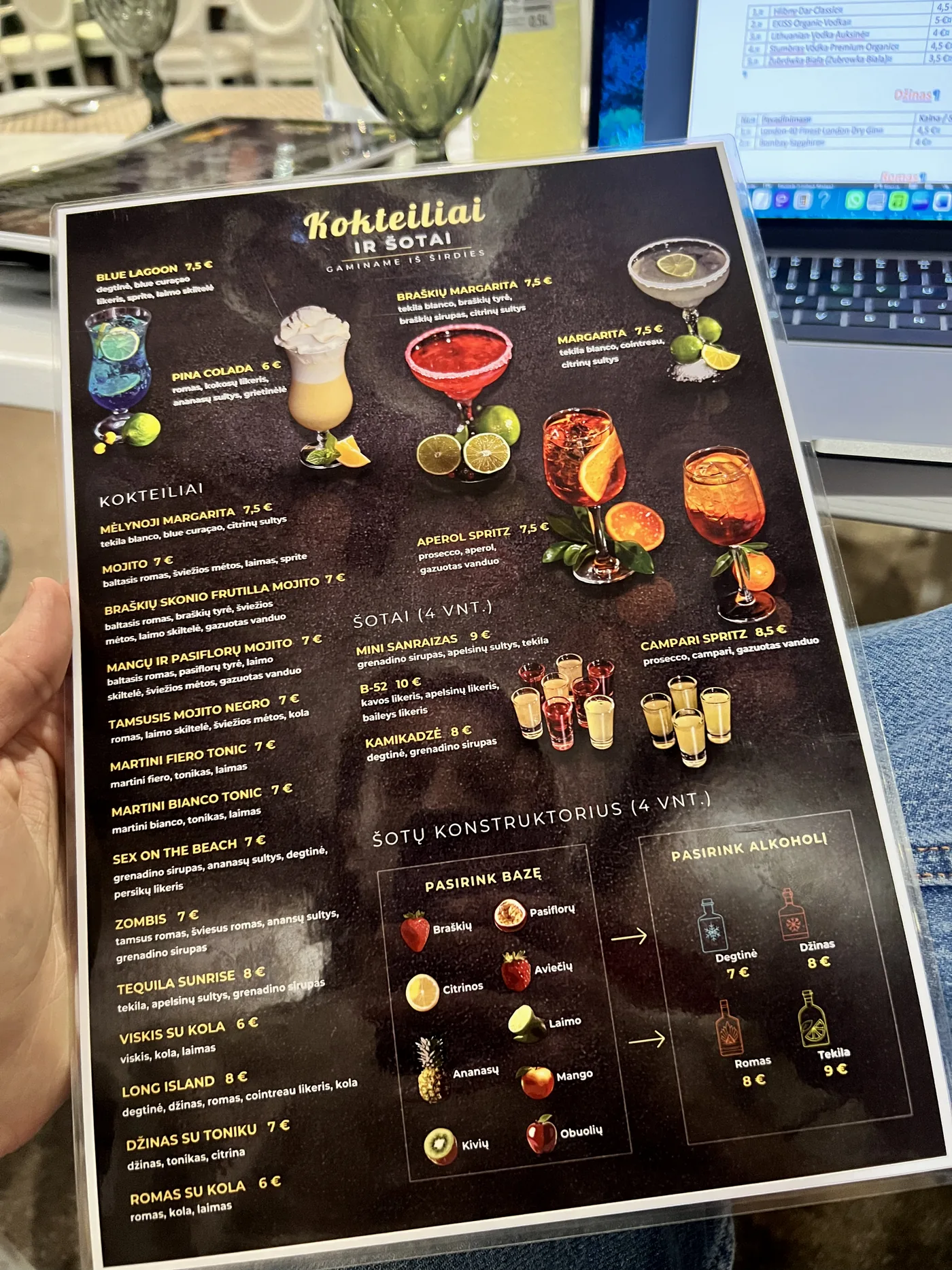
The homepage featured cocktails and shots. As there were so many cocktails, we had to select just the six best shots. You can’t show everything at once. Good menu design for a restaurant often refers not to the maximum number, but to the right choice of accents.
The six cocktail images were arranged to give the page a sense of rhythm: colourful drinks, a dark, modern stone-textured background, the yellow tones of the menu, and mirror reflections. The reflections here are not merely decorative. They help the drinks look more substantial, create the impression of a tabletop and add a touch of professionalism that a simple list of products would lack.
A shot builder instead of a complex diagram
Before the layout was finalised, the section on shots was complex and difficult to read. A clearer solution was therefore chosen – a shot builder. The customer first selects a flavour base, then the alcohol. Instead of confusing text, there is a visual logic that can be understood in a matter of seconds.
This is a small but important UX solution in print design. A menu shouldn’t be a work of art for art’s sake. It should help people make a choice. Once a person understands how to use the menu, they no longer get stuck on the layout and can choose a drink.
Page two: lots of information, but a clear structure
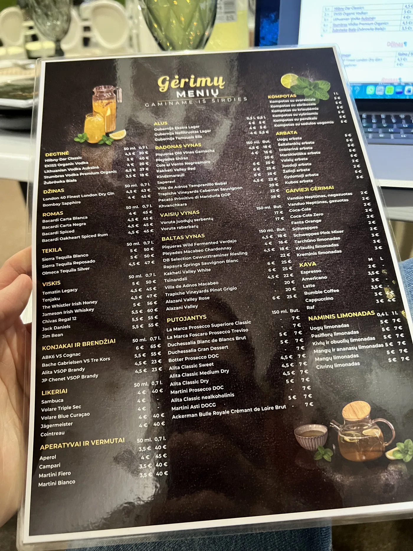
On the second page of the menu, there were even more drinks: vodka, gin, rum, tequila, whisky, cognacs, liqueurs, aperitifs, wines, sparkling wines, fruit compotes, tea, soft drinks, coffee and homemade lemonades. This section is essentially informational. It needs to accommodate a lot of information without looking like a haphazardly crammed list.
The biggest challenge was space. The names of the wines and champagnes had to be shortened, as it was important to specify not only the name, but also the country of origin and the flavour: dry, semi-dry, sweet or semi-sweet. Consequently, the layout had to be calculated precisely: the length of the names, spacing, column width, price alignment and the hierarchy of sections.
Although this side looks more like a list, this was dictated by practical necessity. It was important for the restaurant owner to be able to conveniently fit a wide range of dishes onto a single menu. The bold section headings help the eye scan the page, whilst the yellow colour complements the overall feel of the menu and prevents the dark background from becoming too heavy.
The A4 format requires discipline
This drinks menu was designed in A4 format, so it was necessary to strike a very precise balance between the amount of information and readability. An A4 sheet is not infinite. If the text is too small, the menu looks neat only on screen, but doesn’t work in reality (in the restaurant). If the spacing is too wide, the range of drinks no longer fits.
Several technical aspects are important here: sufficient contrast, a clear placement of prices, consistent spacing between blocks, a uniform text hierarchy, and a typeface family that complements the stylistic approach of Omar Khayyam CHAYKHANA. As the owner did not have a PNG file of the logo, a typographic solution was chosen: to create lettering that captures the restaurant’s atmosphere, similar to the distinctive Omar Khayyam CHAYKHANA lettering visible upon entering the restaurant.
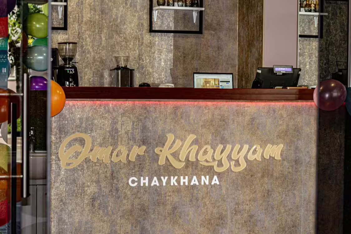
What does the menu look like in real life?
Below is the menu, already printed and laminated. This is an important part of the project, as a layout that looks good on screen must also work well in real-world lighting conditions, with glare, when held in the hand, and within the restaurant environment.
Printing, lamination and the final impression
The final menu was produced with high resolution to ensure that fine details, the vibrancy of the photographs and the clarity of the text were not lost during printing. The menu was printed on both sides and laminated. The lamination added a glossy finish, but also meant that the design had to withstand light, reflections and everyday use in a restaurant environment.
The final result looks professional, informative and colourful enough to showcase the wide range of drinks on offer. The owner was pleased with the result, as the menu not only looks attractive but also clearly presents what the restaurant has to offer. The work was completed in about a week, one day of which was set aside for photographing the drinks.
What does this work illustrate well?
This restaurant menu design clearly illustrates that, in print work, it is not just an attractive layout that matters. It is important to understand how a person will read the menu at the table, what information they need to find quickly, where it is worth using an image, and where it is better to stick to a clear list.
- Real photographs of drinks help the client to see the actual result, rather than a generic illustration.
- The block builder simplifies the selection process and makes the block easy to understand.
- The dark, stone-effect background and yellow accents create a modern yet warm atmosphere in the restaurant.
- The clear A4 layout allows a lot of information to be included without compromising readability.
This is layout design for publications In practice, it is not just a matter of arranging text on a page, but of creating a logical structure that works in practice. Such print design must be attractive and, above all, it must be useful.
If you’re interested in the visual presentation of drinks not on the menu but on the product itself, a related topic is Mead label design with a non-standard cut. There, more attention is paid to the design of the label, the consistency of the flavours and the files prepared for the printer.
Do you need a menu design for a restaurant?
If a restaurant, café or bar needs a clear, professionally designed menu, it’s worth starting not with fancy effects, but with the structure. What should the customer see first, what needs to be compared quickly, and where can visuals help to drive sales? Radeimo can help you prepare a menu design for print, from structure and layout to visual presentation and preparing files for the printer. Get in touch and let’s discuss what sort of menu your business needs.