
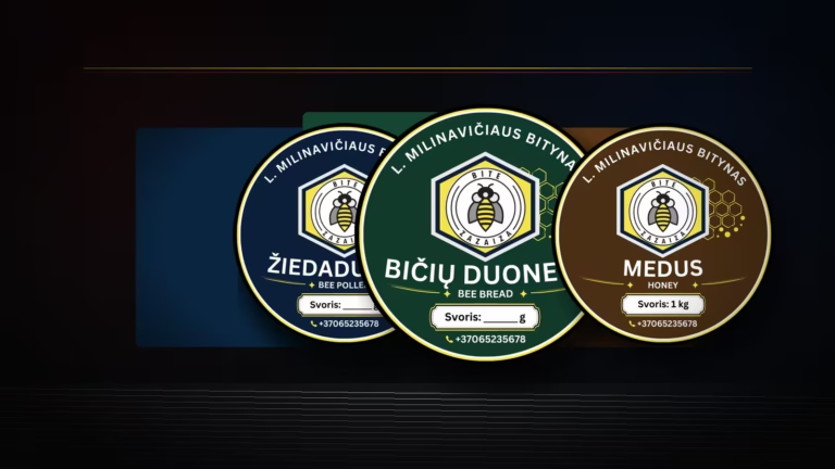
When a client comes in with an existing logo and says they need to update their stickers, the logo itself is not yet a design. It is a starting point. In this project for Bitė Zazaiza, the aim was to create a system of stickers for three products – honey, bee bread and pollen – based on a single existing logo.
The task seemed straightforward, but the details are what really matter here. The sticker will be approximately 5 x 5 cm in size, so it must look good not only when zoomed in on a screen, but also in its actual printed form. The text must remain legible, the colours must not bleed into one another, and the entire line must look seamless.
It all started with just a logo
The clients had the Bitė Zazaiza logo, but the task was not simply to place it on a circle; rather, it was to create a complete label design featuring the product name, a colour scheme, decorative elements, contact details and a clear weight indication.
Bityno’s products have a warm, natural feel, but the stickers were not meant to look rustic or old-fashioned. The aim was to achieve a more modern, neat and professional look that would still retain a sense of cosiness. In projects like this, it’s important not to overdo it, as too many details on a 5 cm sticker very quickly become overwhelming.
Three products, one visual identity
Three sticker designs were created for pollen, bee bread and honey. All are based on the same logo, the same circular shape, a similar hierarchy of information and a common decorative rhythm. The difference lies in the dark blue, green and brown backgrounds, making it easy to distinguish between the products.
Consistency was very important here. If all three stickers were completely different, the product range would look haphazard. If they were all identical, it would be harder for the customer to quickly tell which product was which. That is why a middle ground was chosen: a single family with three distinct characters.
The article provides a more detailed account of the general principles for planning this sort of work prior to publication Sticker design for businesses: how to prepare for printing. The case of Bitė Zazaiza is a practical example of such a process.
Universal weight field
One of the client’s practical requests was to leave space for the weight. As the stickers were to be used for a variety of purposes, some of the layouts included a clear space for the weight to be written in by hand. This may seem like a minor detail, but in print, such details make all the difference.
If a separate label were required for each quantity, this would result in more files, more confusion and more printing waste. A universal weight field allows the same design to be used more flexibly, particularly when product quantities may vary.
It’s not just the image that matters to the press
There are two sides to sticker design. One is the aesthetic aspect, where colour, composition, the logo and the overall impression come together. The other is the technical aspect, where dimensions, resolution, legibility, spacing, the bleed area and the printer’s requirements are all important.
In this case, the stickers are designed to be round, measuring approximately 5 x 5 cm. As this shape is standard for printing houses, the cut-out line can be adapted for a round sticker in accordance with the printing house’s requirements. Nevertheless, it is important that the text and decorative elements do not extend too close to the edge.
Before sending the layouts to the printers, it was important to check that the smaller text would not be too fine. This is one of the most common mistakes made when designing labels. Everything looks like it’s in large letters on the screen, but when printed at actual size, it becomes clear that some of the information requires squinting to read.
The files were prepared in high-resolution format to ensure the stickers were vivid and to allow for some leeway should they need to be printed in a larger size at a later date. This approach is similar to that used for other print design projects. For example, when preparing layout design for publications, a beautiful view still needs to be technically sound.
The DI visualisation helped to convey the overall feel
In addition, a visualisation using artificial intelligence was created to show more clearly how the stickers might look on actual packaging. Transparency is key here. Such an illustration is not a photograph of the final printed product. It helps to convey the direction, the feel of the packaging and the overall impression of the product range.
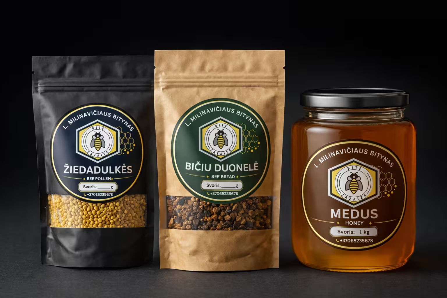
Such visualisations are useful when the client needs not only to approve a flat layout, but also to visualise the product on a shelf, on a jar or on a bag. However, the print-ready layout itself remains the most important element in the final decision.
Later, the same Bitė Zazaiza visual style was adapted for a larger format – Design of mead labels with a non-standard cut. What was needed there was not a small round sticker, but a 120 x 200 mm label featuring different flavours, with a bleed and a separate vector cut-out outline.
Result
The sticker design was completed in less than a week. The clients were delighted, as the stickers look modern, professional and warm. They have a consistent look, yet each product remains recognisable.
This example clearly illustrates why a small design format does not necessarily mean a small task. There is limited space on a sticker, so every element must work together. The logo, colour, text, shape, contact details and even the empty space for the weight must all serve a clear purpose.
If you need to design and prepare a sticker for a product, it’s best not to start by asking, "What shall we put on the sticker?". It’s better to ask how the sticker will be used, what size it will be, what the user needs to read first, and how the entire product range will look together. Once you have a logo, your products and a clear purpose for their use, please get in touch. We can create a sticker that looks good not only on screen but also in print.